Customization Effort: High
Profile: In-Person or Hybrid with an In-Person Focus
Cautions: Festivals with separate in-person and online dates
Mediterranean is a site theme that emphasizes the in-person festival.
The home page is simple with the goal of driving the audience to the events that most interest them.
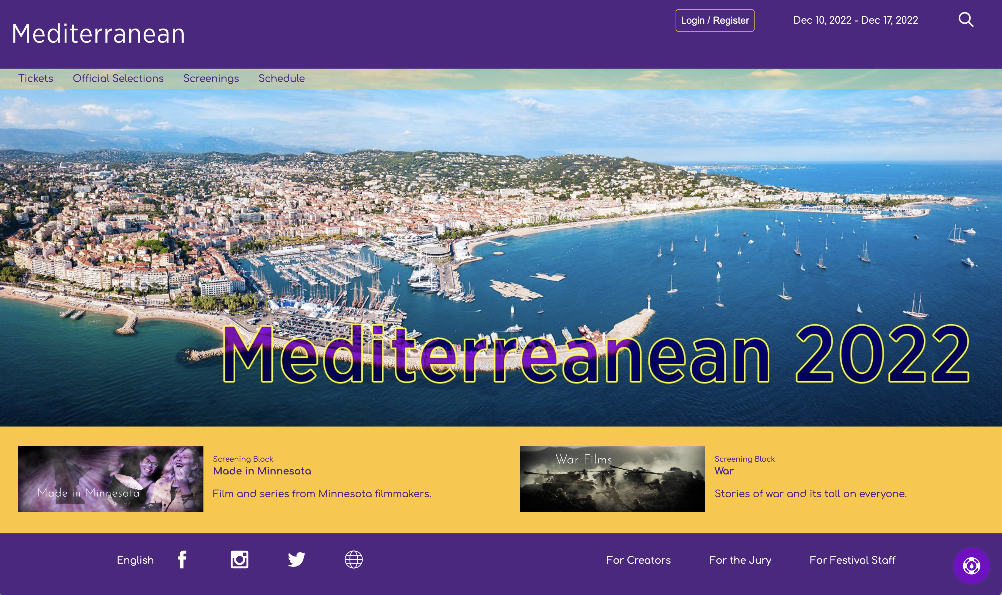
An example of a Mediterranean home page
The focus on the home page is either a looped video or your edition banner. Below, it highlights selections and festival events. This theme relies heavily on customizing the colors of individual elements, so the brand colors are not used as regularly as with some other themes.
It is not the best theme for festivals with different online and in-person dates, as the header can become crowded by the dates on mobile devices.
Colors
In addition to the brand colors, the Mediterranean theme asks for the following special colors:
Feature Background - The home page and child pages each have a "feature area" that uses the "Feature Background" for the background color. On the home page, the "feature area" is the area highlighting a pair of selections or events. In the home page example above, the "Feature Background" is yellow. For the ATL site, they used the light background color as the "Feature Background" as well.
Feature Text - The text appearing on the "Feature Background".
Header Background - The color of the header on each page. In the example above, dark blue serves as the "Header Background" color. On this site, the "Header Background" happens to be the same color as the dark brand color, but you do not need to follow that convention.
Header Text - The text appearing on the "Header Background"
Footer Background - The color of the footer on each page. In the example above, dark blue serves as the "Footer Background" color. On this site, the "Footer Background" happens to be the same color as the dark brand color, but you do not need to follow that convention.
Footer Text - The text appearing on the "Footer Background"
Home Menu Background - The background color for the menu ("Tickets, Official Selections, etc.") on the home page, only. We apply an opacity to this color so the image or video will show through it. When in doubt, leave this color as white. The primary reasons for customizing this color are to have some reflection of your brand color or if your choice of home page banner/video requires a darker color.
Home Menu Text - The text for the menu on the home page. This color should be white or some other light color. Even on a white home background, white will generally look best because of the applied opacity. When in doubt, leave this color as white.
Dark Link Colors - The text for all web page links on a white background. If you have a dark enough Light Brand color, then it makes a good Dark Link color as well. Do not, however, use your Dark Brand color because that is used for titles and you want some kind of color to differentiate titles and links. If your Light Brand color is too light to appear on a white background, select a color that is a slight variant your Dark Brand color. It should be enough of a variant that you can tell the difference between titles and links.
The colors configured for the demo site shown in the screenshots are:
- Dark Brand Color: Purple
- Light Brand Color: Gold
- Dark Brand Contrast Color: Gold
- Light Brand Contrast Color: Purple
- Feature Background: Gold
- Feature Text: Purple
- Header Background: Purple
- Header Text: White
- Footer Background: Purple
- Footer Text: White
- Home Menu Background: Gold
- Home Menu Text: Purple
- Dark Links: Bright Purple
- KB Button: Bright Purple
Pages
Mediterranean does not include any unique pages. This section, however, provides examples of what you can expect each page to look like. Actual pages naturally depend on how you have configured the theme and what content has been uploaded.
Common Elements
All pages share a common header and footer template. Inside the header, there are placements for your top-level sponsor. All sponsors of this type appear on every page of the site without any rotation.
Another important element in the header are the festival dates. How the dates appear depends on whether your festival is configured for the same online and in-person dates. If so, a single set of dates will appear in the header. Otherwise, it will show the separate online and in-person dates.
The footer includes all of your social links as well as links to the SparqFest creator, judge, and staff portals. If your site is configured for multiple languages, a language preference option also appears in the footer.
Another common components is the main menu across the top. What items appear in the main menu depend on what content you have uploaded and what stage your festival is at. The "Ticketing" link, for example, shows up only when you have tickets to sell. If your festival is not using our ticketing or your festival dates have passed, that link will not be live.
Possible links are:
- Tickets - a link to the ticketing page
- Official Selections - a link to the list of Official Selections
- Events - a link to all non-screening events
- Screenings - a link to a list of all screenings whether virtual or in-person
- Venues - a link to a list of venues for the current edition of the festival
- Merchandise - if you have configured merchandising, a link to your merchandising site
- Full Schedule - a link to a full schedule of the festival structured as a calendar
In addition, once logged in, a user can access the following pages:
- User Profile Page - manage preferences and payment information
- Watch List - manage favorited selections and quick access to previously watched content
- Audience Choice Voting - page for participating in audience choice voting
Finally, the following pages are child pages to some of the above pages:
- Selection Page - all content we have collected from a specific selection
- Event Page - information about a specific event or screening
- Venue Page - information about a festival venue
Home Page
The home page includes the standard header and footer with a "welcome" image or video. The welcome image is the default and is required even if you provide a welcome video. This welcome image is the banner for the current edition of your festival. If the current edition is in the future or in progress, it will show the configured welcome banner. If, on the other hand, the current edition has passed, it will show the post-festival banner. Both are configured in the Staff Portal under "Settings" | "Editions" | [Current Edition] | "Graphics".
A new feature introduced with Mediterranean is the ability to have a welcome video that loops silently on the home page. By the time you read this, there should be an option to upload a welcome video in the same area where you upload the welcome banner. If that option is not yet available, send contact SparqFest support and we will configure it for you.
Welcome Banner Requirements: 1940x692 JPG, PNG, or WebP image
Post-Festival Banner Requirements: 1940x692 JPG, PNG, or WebP image
Welcome Video Requirements: H.264 MP4 video at 1940x692

The Mediterranean home page
Because Mediterranean does not overlay any text on the home page, you should feel free to include text in the welcome banner and video.
Below the welcome banner is a spot for two rotating highlights. These highlighted items are calculated roughly once every four hours. The logic for what is highlighted depends on what stage your festival is in and what content is available.
When you are just getting started with SparqFest, this section will not exist because you will have no content to highlights.
As you add content, the system will randomly highlights selections and events. In an approaching or live festival, the system tries to highlight one selection and one future event.
For a selection to be highlighted, you must have "publicize selections" on in the edition settings. With publicize selections on, one of the above spaces will be occupied by a random selection that has completed uploading its information. If no selections qualify, the system will simply highlight two events.
For an event to be highlighted, the current date must be after the event's promotion start date, but before the start of the event itself. If no events match these criteria, then the system will highlight two selections.
The system highlights awards winners when the current edition of your festival is in the past. It can do so, however, only if you are using the judging module and have named award winners that have been made public by the judging module. If you did not use our judging module, the system again falls back to randomly picking two selections to highlight.
Ticketing Page
As noted above, the ticketing page is available on the site only if you currently have tickets to sell.
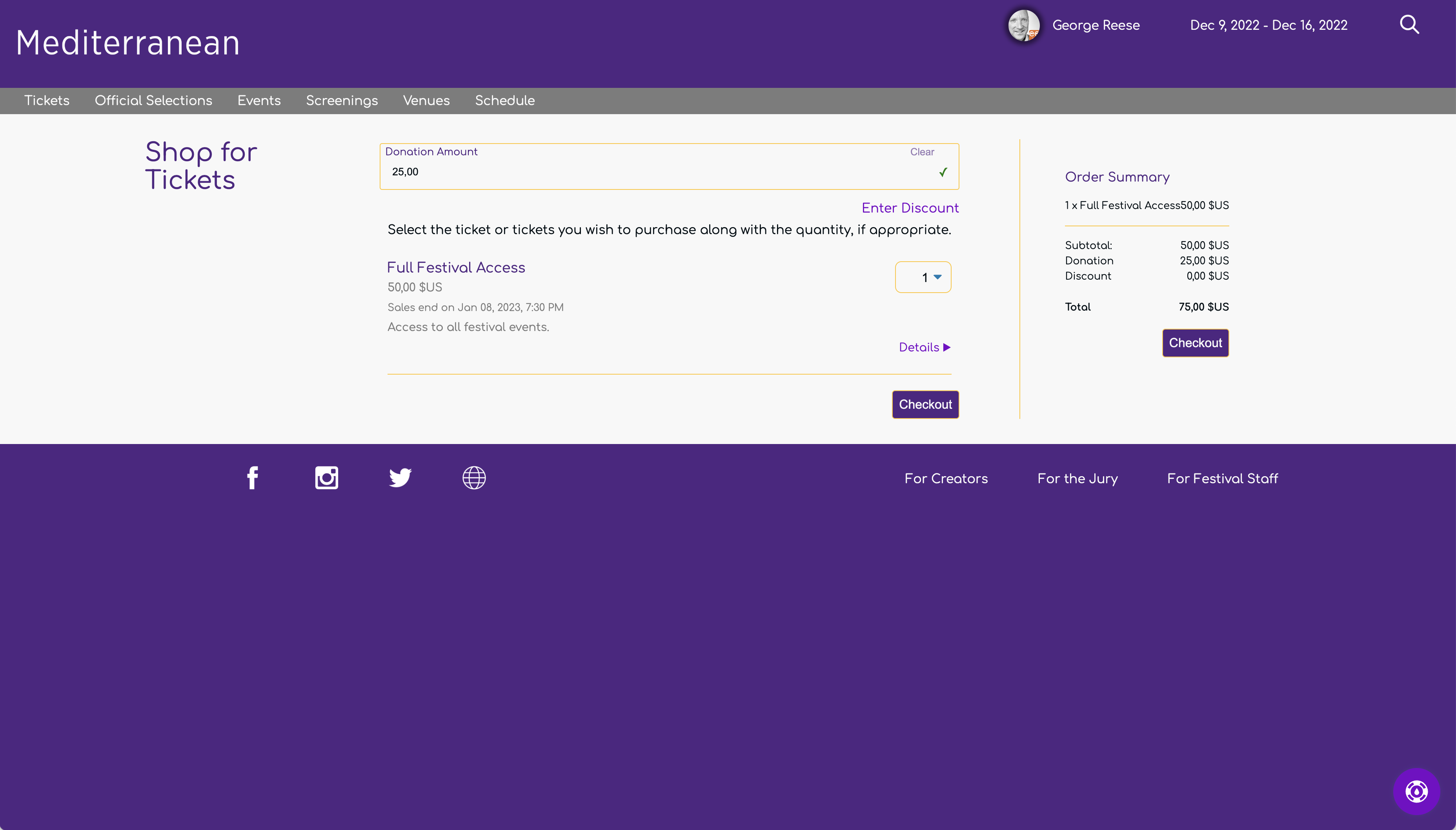
An example of a Mediterranean Ticketing Page
Note: The browser in the above example is configured with a "comma" as a decimal separated as is common in Europe.
As you would expect, the ticketing page lists all available tickets and enables the audience to purchase tickets. A common design for child pages under the Mediterranean theme is the title of the page on the left, the main content in the middle, and supplementary information on the right.
In the case of the ticketing page, the main content is the list of tickets from which users may select. When a quantity is selected for a ticket, the purchase information on the right is updated. Up at the top, the user has the ability to enter a discount code as well as donate to the festival if you have configured your festival to accept donations.
Official Selections Page
The Official Selections page enables visitors to see all Official Selections that have uploaded sufficient information. As you might expect, a selection appears on this page only if "publicize selections" is enabled for the edition of the festival with which it is associated.
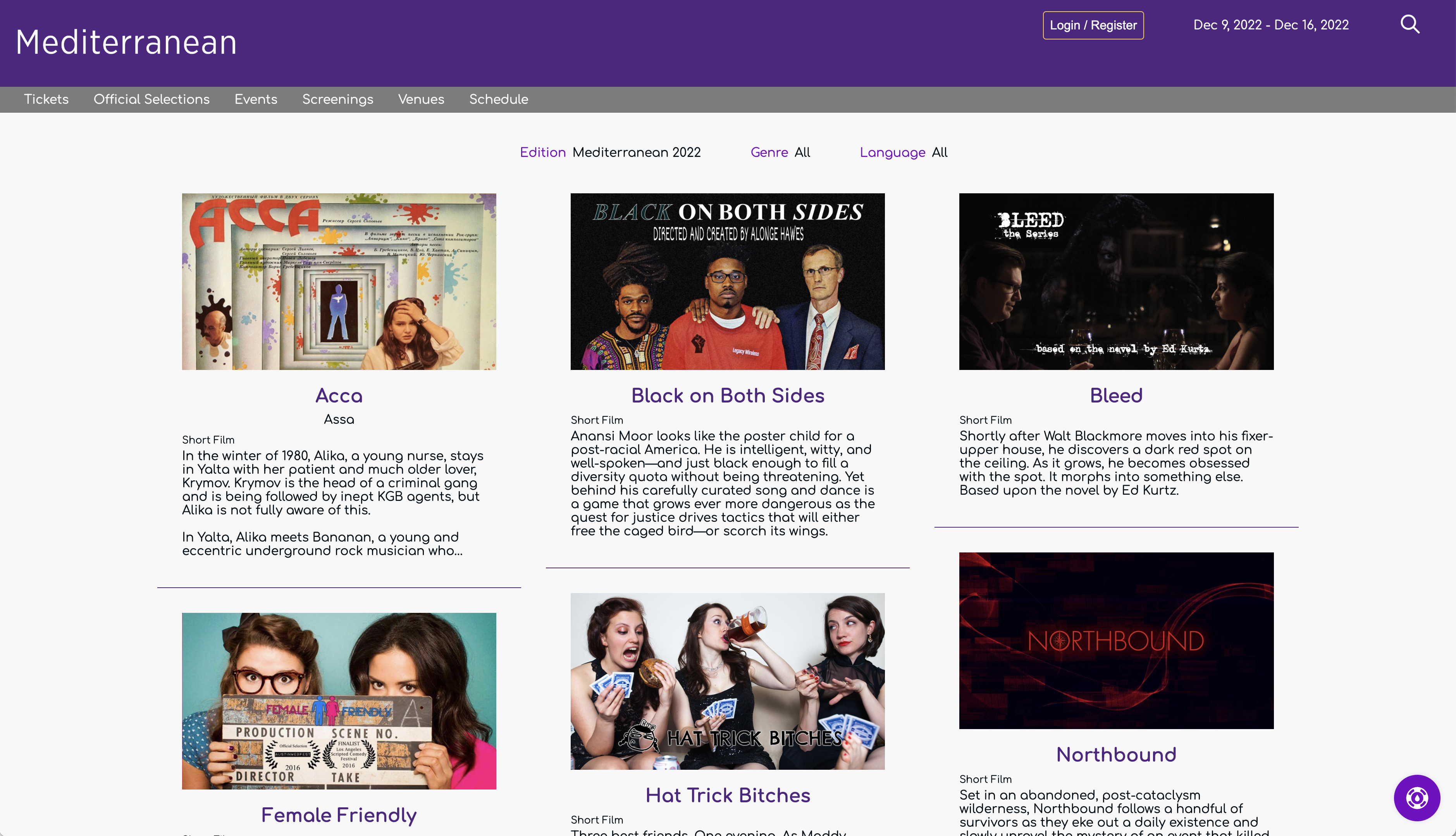
The Mediterranean Official Selections Page
When you go to this page, it not only lists the selections, but also lets you filter the list. What filters are available depend on how you have configured the festival in the festival settings area of the Staff Portal. For example, this festival has enabled the "promote genres" and "promote languages" settings. That means users can filter by genre or language. In addition, if you have been with us through multiple editions of your festival, people can see an archive of old selections.
Each selection shows its poster, the title, and a few sentences from the show synopsis. A user can click on the selection to get to the main page for that selection (aka the selection page).
Selection Page
Each Official Selection receives its own "Selection Page". The selection page enables the visitor to see all the information we have collected on the selection and, if allowed, view the selection "on-demand".
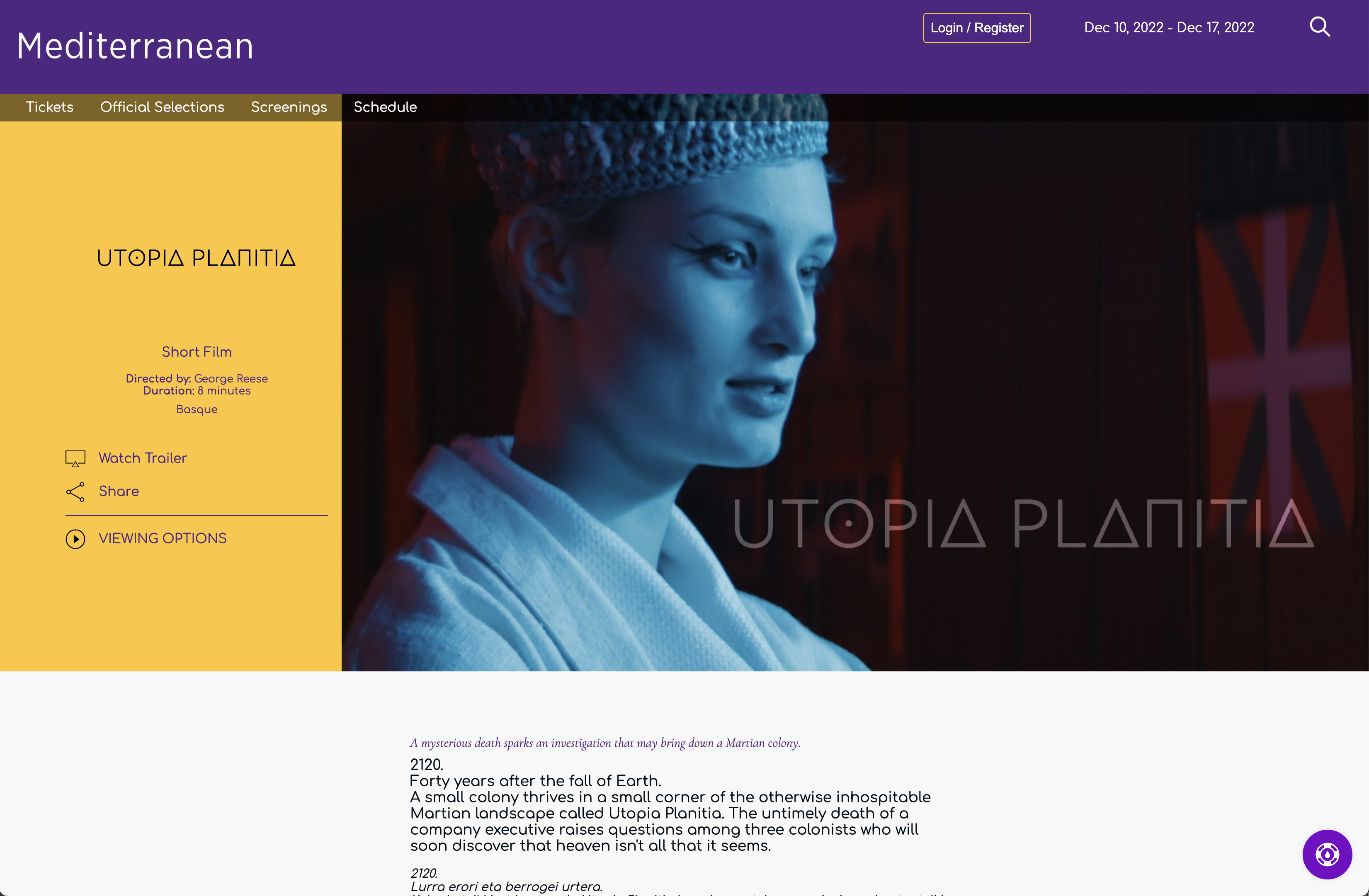
"Utopia Planitia" as represented at in the Mediterranean them
The example above highlights how we handle selections in a language that differs from the user's configured language. If the user had been configured for Basque and the site supported Basque, this page would have shown up entirely in Basque with no English content. This site was configured, however, as an English-language festival and the user has their language preference set to English. Nevertheless, because the selection is a Basque language selection, the page includes the original Basque language synopsis in addition to the English synopsis. Because the title is in Latin no matter what language the selection is marketed in, only the Latin title shows. If it had a Basque title, both the Basque and English titles would be showing.
The top of the selection page highlights the project's poster with critical information about the selection, including how people can watch the selection. The background color for this highlights section is the Feature Background Color from the Mediterranean theme. The text color is similarly the Feature Text color. Note: no matter what is configured for the feature text color, the icons will be either black or white.
Below the poster is the main content: the longline, the synopsis, and all meta-data, cast and crew information, and awards.
Events Page
The events page lists all non-screening events. In other words, the events page will list both live streams as well as all in-person events EXCEPT in-person events with an event type of "Screening".
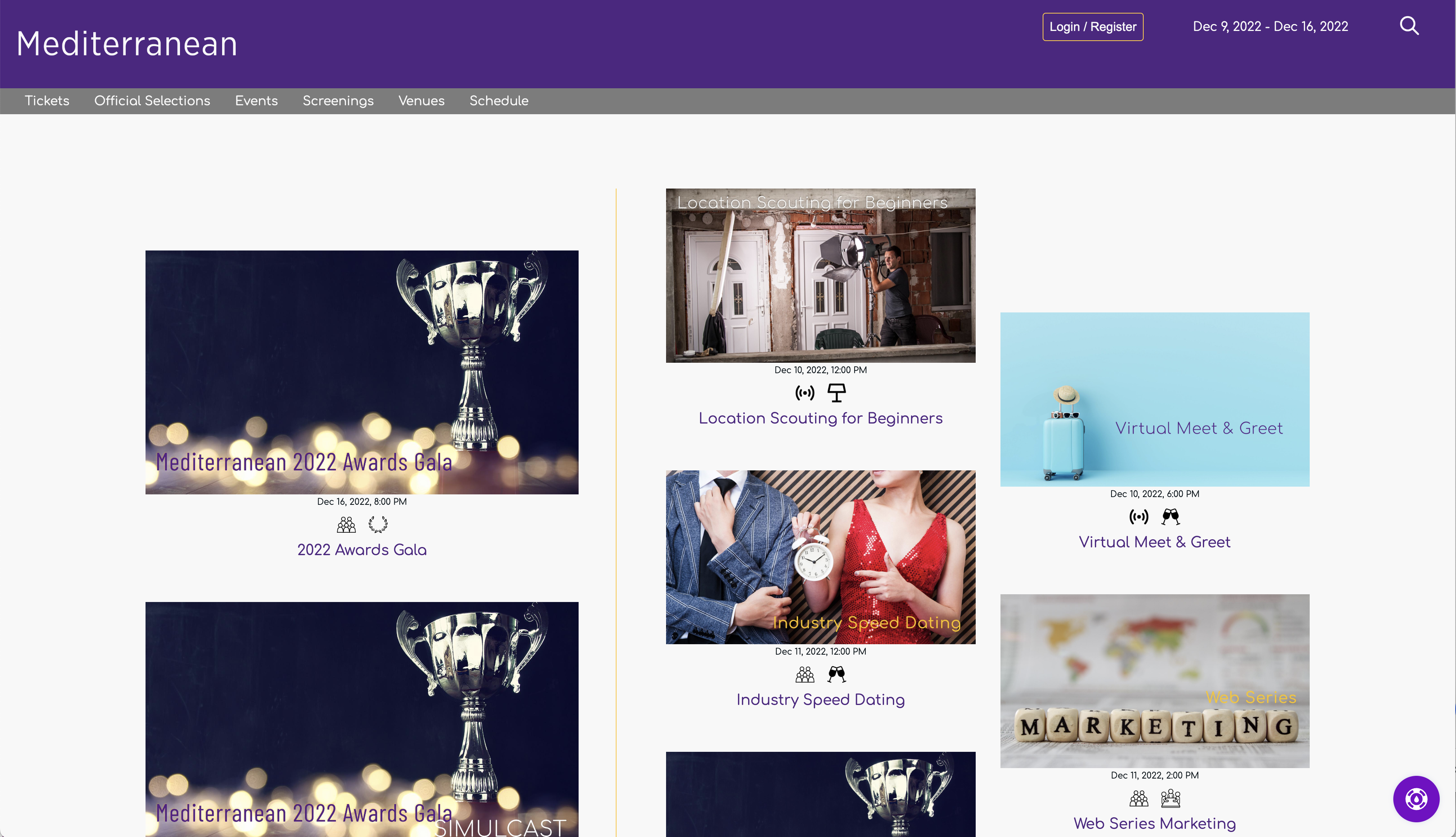
The Mediterranean Events Page
On the left side (right side when configured with a right-to-left language) are two highlighted events. If you have an awards ceremony, the awards ceremony will always occupy the first position. The second position is the next upcoming event. If your festival does not include an awards ceremony, the next two events will be highlighted.
On the right side is the full list of events ordered by start time with past events moved to the end of the list. Viewers can see at a glance what kind of event each event is and whether it is in-person or online. Each event naturally links to its full event page.
Event Page
The event page is the official home for each event, including screening blocks and in-person screenings.
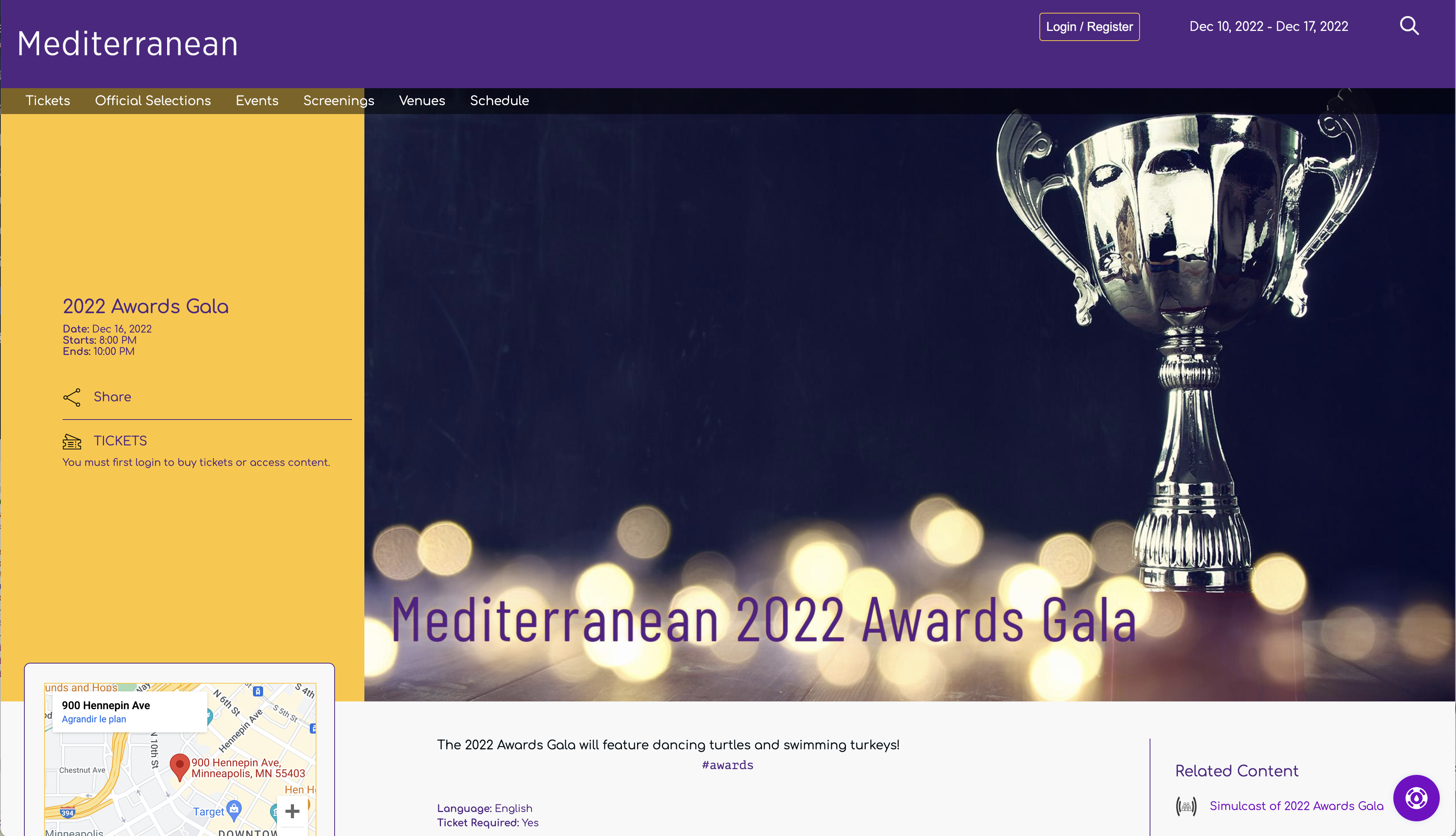
A sample awards ceremony page under Mediterranean
The event page contains all information you have provided about the event, including links to the venue, a map showing the location, and any related content like a live streamed simulcast. Visitors can purchase tickets to attend the event straight from this page. Because the event in the example above has already occurred, there is a message that the event has passed instead of a button to purchase tickets.
The colors for the informational area in the upper left of the screen (the turquoise area above) are determined from your configured Feature Background/Feature Text colors.
The "Related Content" title is the Dark Brand Color and the links that follow are the Dark Links color. For Minnesota WebFest, they used the same color for Dark Links as they used for Light Brand Color because it happens to work. In most cases, both the Light Brand Color and Dark Brand Color do not make appropriate Dark Link colors.
Live Streams
Live streams differ from what is shown above in that there is obviously no venue map and visitors are provided with a real time glance at how much time remains until they can join the live stream. Once the lobby for your live stream opens, a "Join Now" button appears on the page that allows them to join the live stream.
Screenings
Screenings show the full program of selections for the screening event. In-person screenings provide a venue map whereas online screening blocks do not.
Screenings Page
The screenings page lists all screenings associated with your festival. Both screening blocks and in-person events of type "Screening" are listed here.
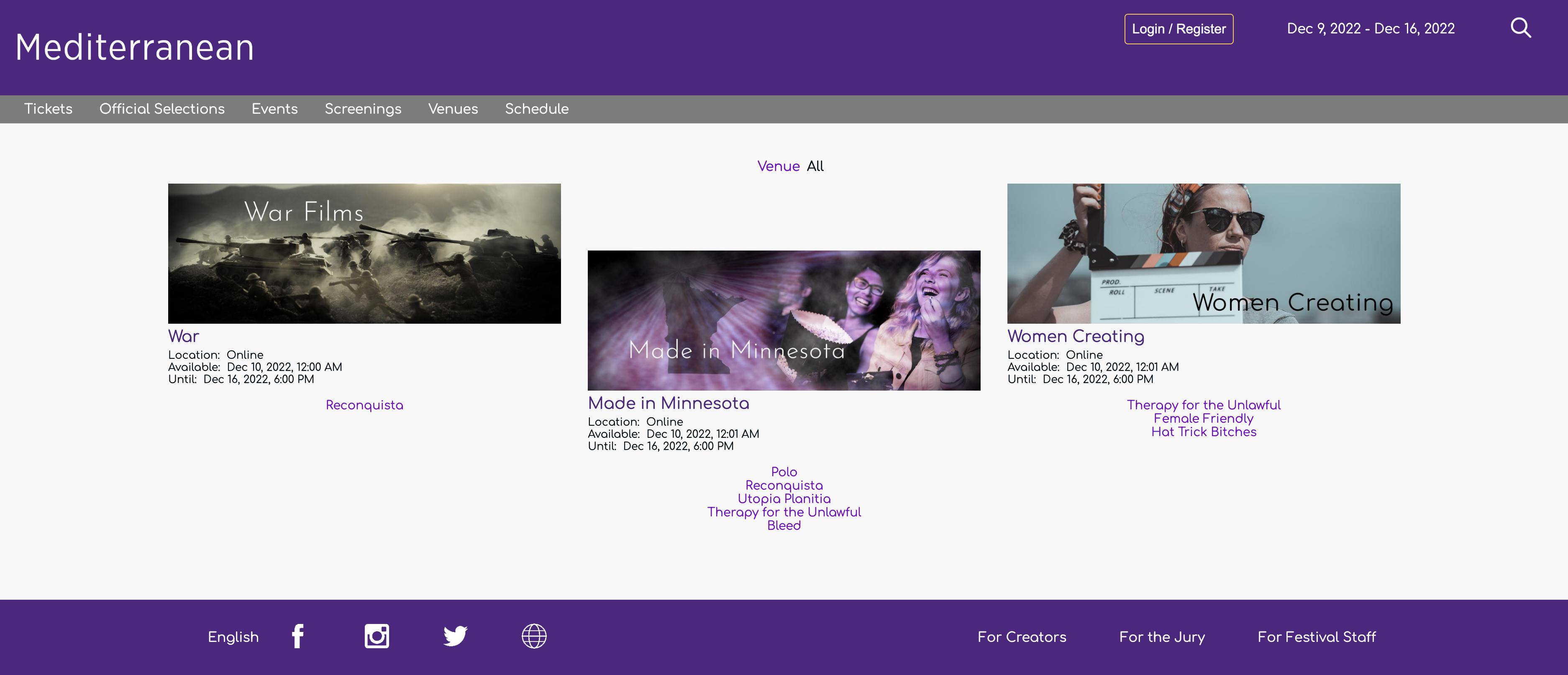
A listing of all screenings via the Mediterranean Screenings Page
The screenings page shows all screenings along with their full program and show times. Times for online screening blocks are in the visitor's time zone and times for in-person blocks are listed in the venue time zone.
The above example shows only in-person screenings. When a festival has both in-person screenings and online screening blocks, they can filter by venue to see all online blocks as well as all screenings at a specific venue.
From this page, the visitor can click through to the event page for the screening as well as the individual selection pages.
Venues Page
The venues page provides a listing of all venues associated with the current edition of the festival. Simply adding a venue in the Staff Portal will not make it show up here. The venue must be associated with an event tied to the active edition of the festival.
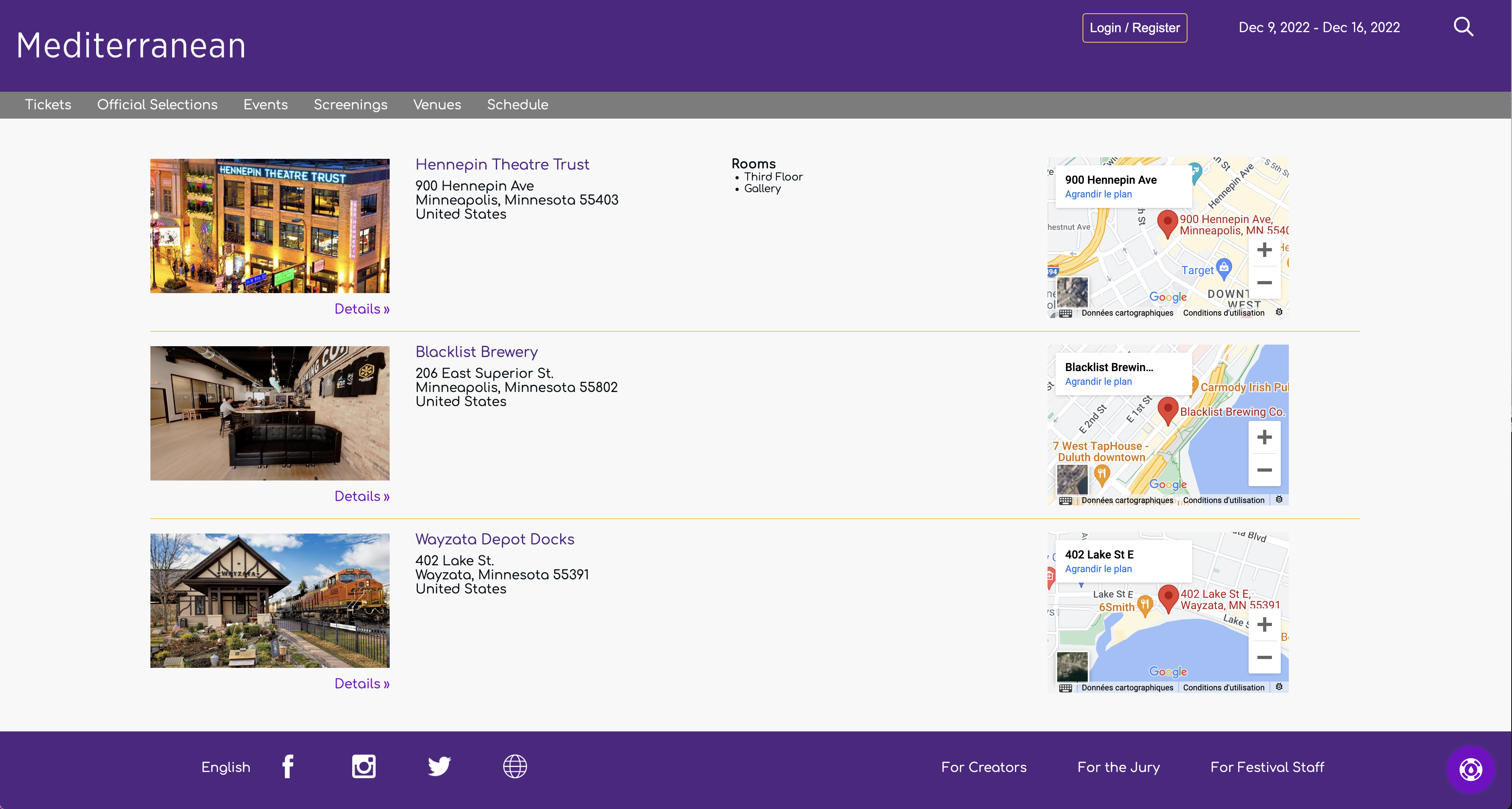
Festival venues as displayed in the Mediterranean theme
Each venue appears with a link to Google Maps for the venue and the venue's venue page. If the venue has rooms associated with it, this page will list all of the rooms.
Venue Page
The venue page shows the details you have provided for each venue.
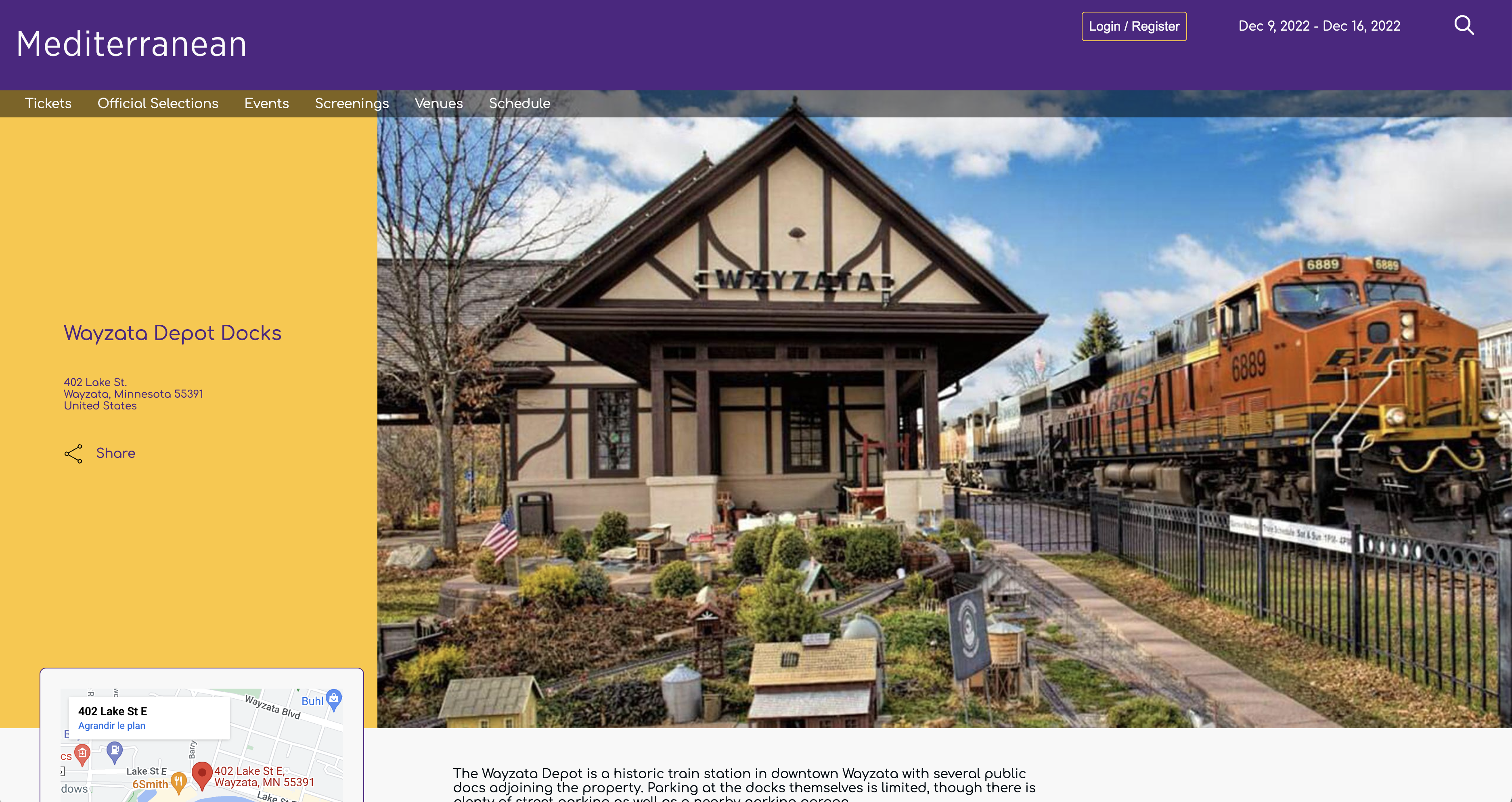
The Venue Page for the the Wayzata Depot Docks as displayed in the Mediterranean theme
The venue page provides visitors with all the information you have provided about the venue along with a full list of festival events that are taking place at the venue.
Merchandise Page
Currently, the merchandise page is an external page you host or from a third-party like Shopify. In the future, we intend to add built-in merchandising capabilities and this theme will support that functionality when added.
Full Schedule Page
The full schedule page shows each day of the festival and its schedule of events.
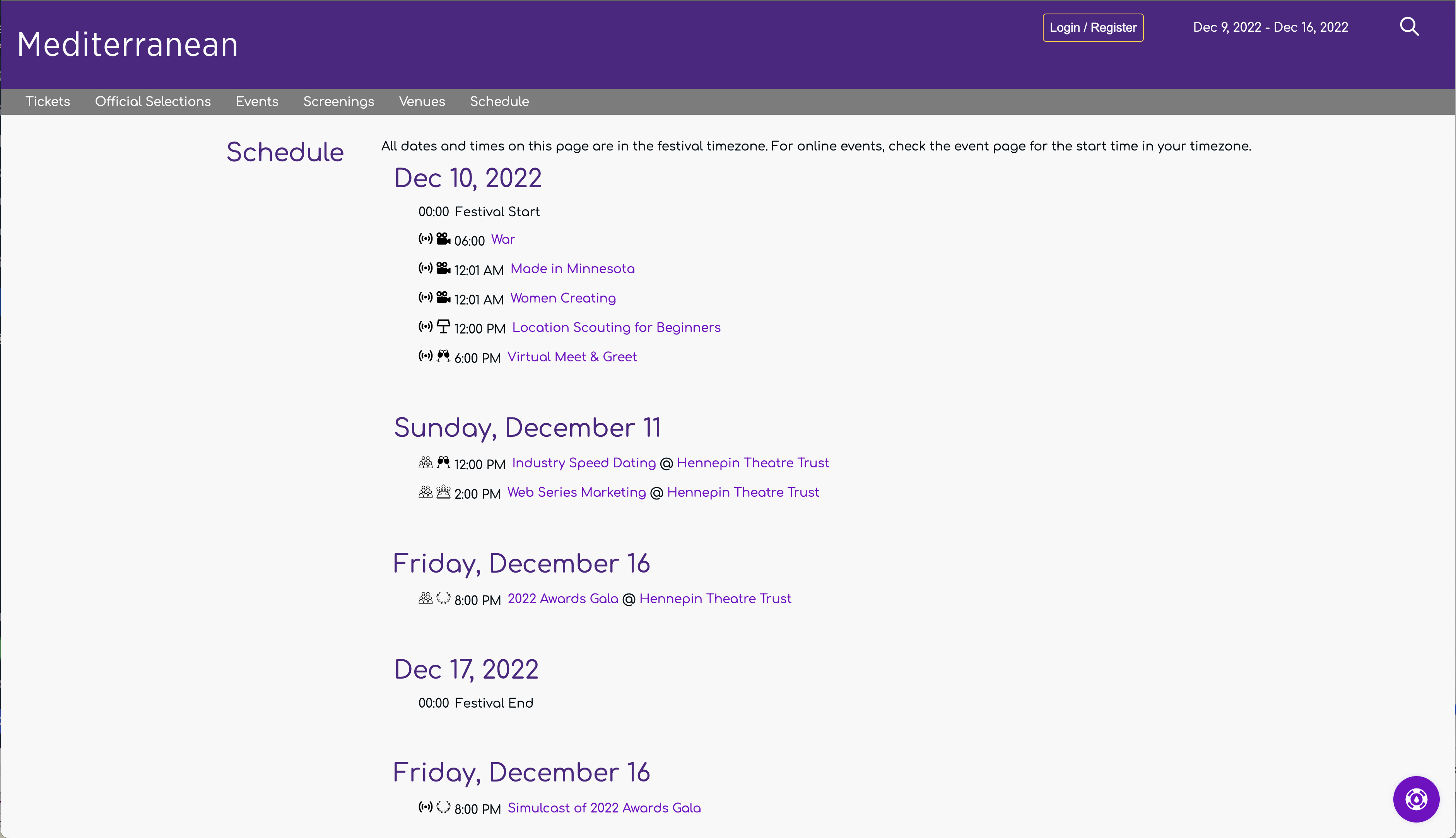
All festival events appear by date on the Schedule Page
Looking at this schedule, your audience can easily differentiate between online and in-person events as well as check where they need to be right now.
User Profile Page
The user profile page is where authenticated users manage their account with your festival.
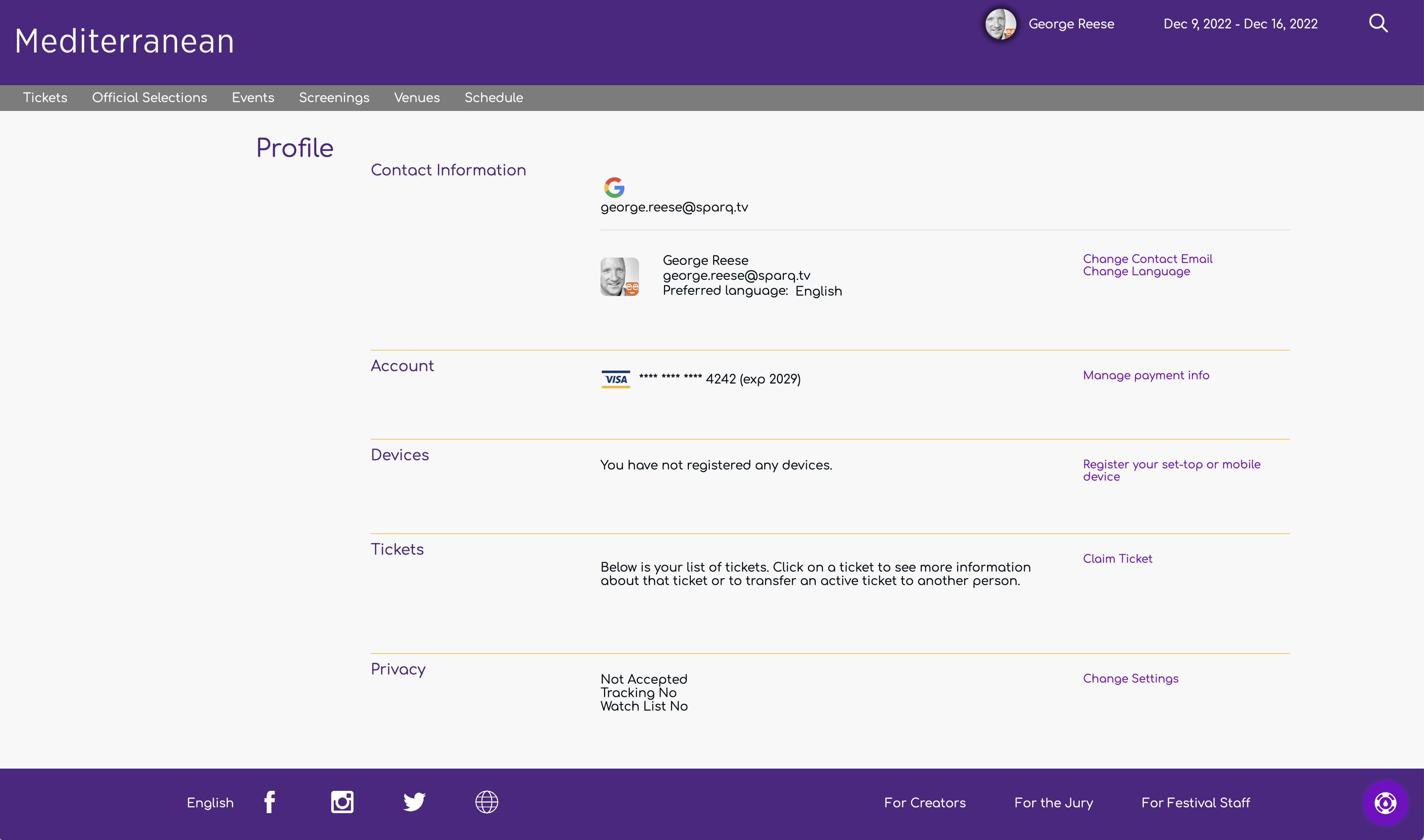
The User Profile Page from Imagine This Women's International Film Festival
This page enables a visitor to transfer tickets, change their contact information, manage payment methods, view device registrations, and control their privacy settings.
Watch List
Visitors have the ability to "favorite" individual selections. In addition, we keep track of everything they have been watching. The watch list page provides them with access both to their favorite selections and everything they have been watching previously.
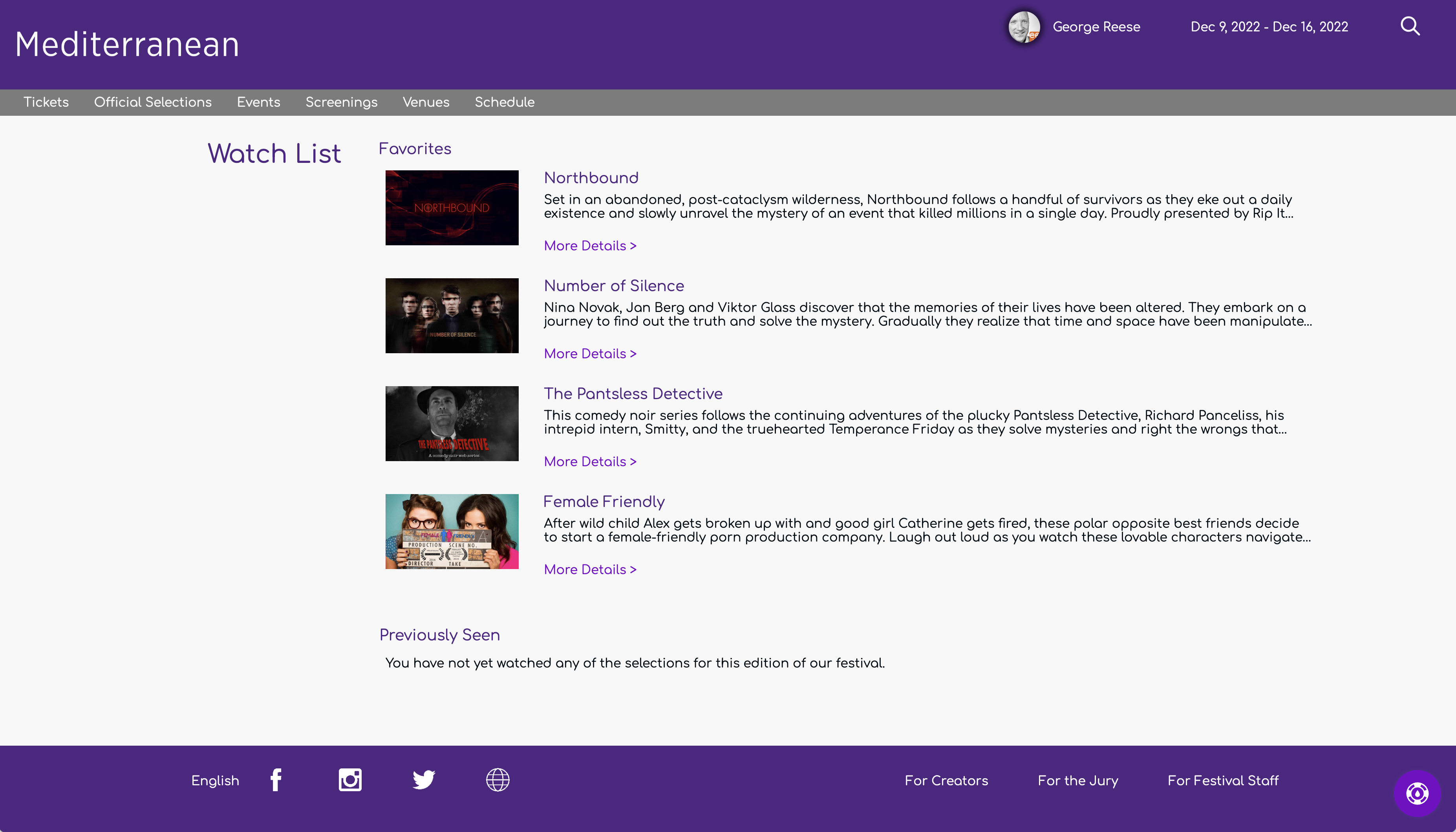
A Watch List page with favorites and previously viewed works
Audience Choice Page
The audience choice page is where your audience goes to vote.
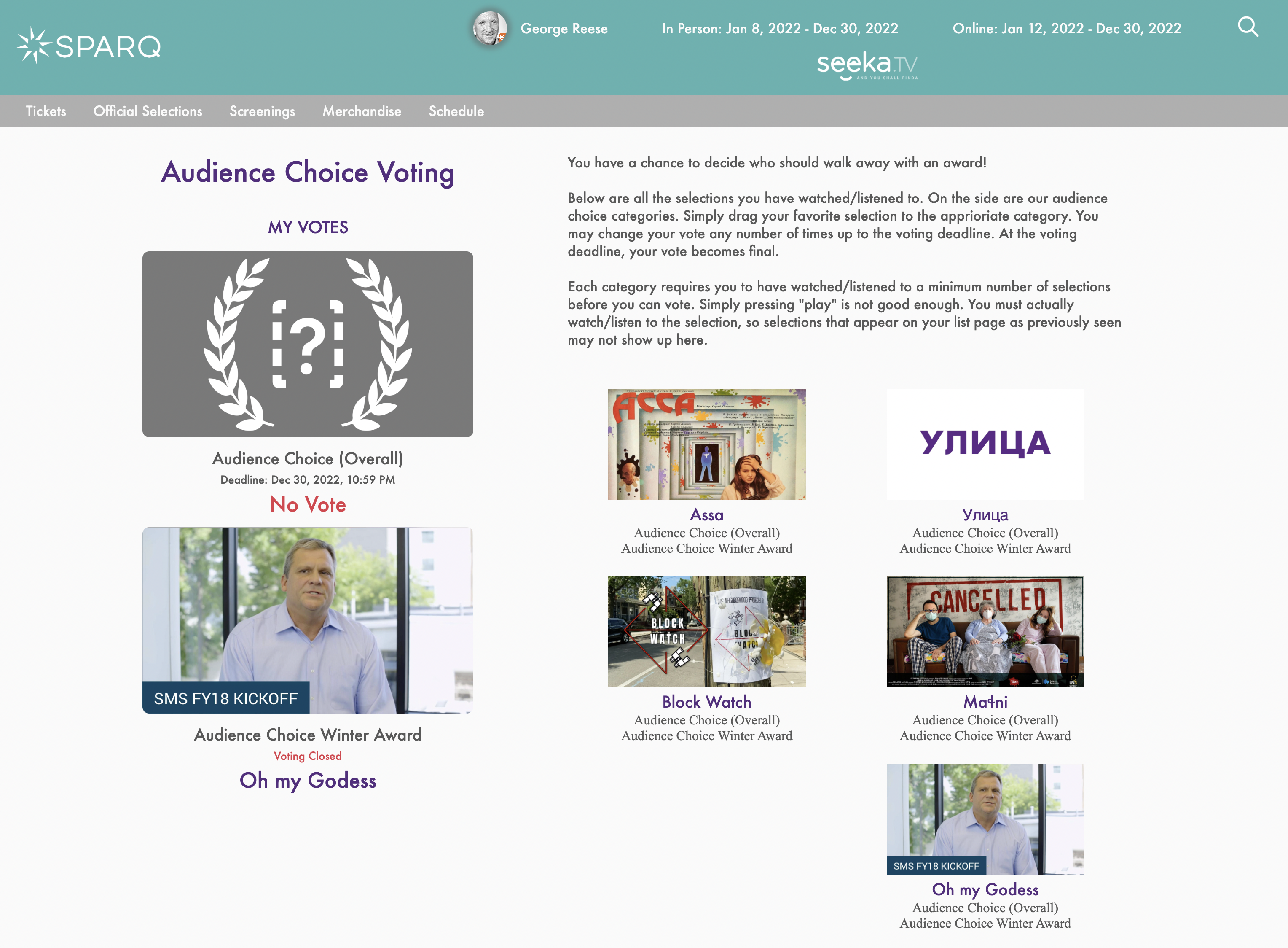
The audience choice pages presents the awards and the possible options
The audience choice page is available only if you are using our judging module to perform audience choice voting. Though a full description of this functionality is outside the scope of this document, this page shows all of the available categories in which a viewer can vote on the left side along with all of the selections the visitor has seen (online or in-person) listed on the right side. The viewer can then drag selections from the right over to the category on the left. Viewers can alternatively click on the category and select from a list eligible selections.