Customization Effort: Moderate
Profile: In-person festivals using our free subscription with an emphasis on festival schedule.
Cautions: Filmmakers with bad posters
The Explorer is our first theme for free subscriptions. Because our free plan does not support the upload and management of video assets, this theme is exclusively for the in-person festival. The focus of this theme is putting the festival schedule front-and-center while promoting all of your Official Selections.

The Explorer home page
Fonts
The default sans-serif font for this theme is Inter. If you opt for a different font, we recommend sticking with clean fonts that are not too “showy”. Explorer uses only normal and bold font weights, so there is no need to find a font with a rich set of thin and light variants.
Colors
Explorer is mostly a white and black theme, using the colors you configure to provide flavor. Thus, there's very little work beyond the standard light/dark brand colors and their contrast colors. In the home page graphic, you can see some of the custom colors in the links and the login button.
The following custom colors are supported:
- Titles - the color of titles on the pages
- KB Widget - the color of the KB widget
- Button Background - the background color of buttons on the site
- Button Text - the color of text on your site buttons
- Footer Background - the color of the background for the footer on each page
- Footer Text - the color of the text in the footers on each page
The colors configured for the demo site shown in the screenshots are:
- Dark Brand Color: Dark Blue
- Light Brand Color: Burnt Orange
- Dark Brand Contrast Color: Gray/White
- Light Brand Contrast Color: Dark Blue
- Dark Links: Burnt Orange
- KB Widget: Burnt Orange
- Titles: Dark Blue
- Button Background: Off-white
- Button Text: Dark Blue
- Footer Background: Off-white
- Footer Text: Dark Blue
Pages
Explorer does not introduce any unique pages. This section, however, provides examples of what you can expect each page to look like. Actual pages naturally depend on how you have configured the theme and what content has been uploaded.
Common Elements
All pages share common header and footer templates. The header is the primary navigation for this theme with the footer including all of your social links as well as links to the SparqFest staff portal.
What items appear in the main menu depend on what content you have uploaded and what stage your festival is at. The "Ticketing" link, for example, shows up only when you have tickets to sell. If your festival is not using our ticketing or your festival dates have passed, that link will not be live.
Possible links are:
- Tickets - a link to the ticketing page
- Official Selections - a link to the list of Official Selections
- Events - a link to all non-screening events
- Screenings - a link to a list of all screenings whether virtual or in-person
- Venues - a link to a list of venues for the current edition of the festival
- Merchandise - if you have configured merchandising, a link to your merchandising site
- Full Schedule - a link to a full schedule of the festival structured as a calendar
In addition, once logged in, a user can access a user profile page where they can manage their preferences and payment information.
Finally, the following pages are child pages to some of the above pages:
- Selection Page - all content we have collected from a specific selection
- Event Page - information about a specific event or screening
- Venue Page - information about a festival venue
Home Page
The home page under explorer displays your welcome and after banners, depending on what time of year it is.
The welcome banner is the default content once you have made a new edition active through the end of the festival. The “after” banner appears once the festival has completed up to the activation of a new edition. Both are configured in the Staff Portal under "Settings" | "Editions" | [Current Edition] | "Graphics".
Welcome Banner Requirements: 1940x692 JPG, PNG, or WebP image
Post-Festival Banner Requirements: 1940x692 JPG, PNG, or WebP image

An example of the Explorer home page
Below the welcome banner is your full schedule of events ordered by date.
Ticketing Page
The ticketing page is available on the site only if you currently have tickets to sell. Otherwise, the menu is hidden.

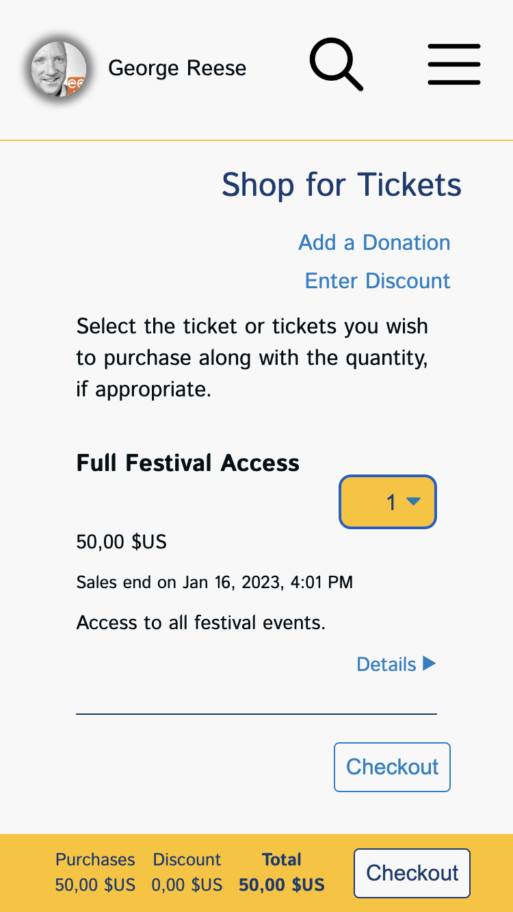
An example of an Explorer Ticketing Page
Note: The browser in the above example is configured with a "comma" as a decimal separated as is common in Europe.
As you would expect, the ticketing page lists all available tickets and enables the audience to purchase tickets. A common design for child pages under the Explorer theme is the title at the top of the page with the body below.
In the case of the ticketing page, the main content is the list of tickets from which users may select. When a quantity is selected for a ticket, the purchase information on the right is updated. Up at the top, the user has the ability to enter a discount code as well as donate to the festival if you have configured your festival to accept donations.
Official Selections Page
The Official Selections page enables visitors to see all Official Selections that have uploaded sufficient information. As you might expect, a selection appears on this page only if "publicize selections" is enabled for the edition of the festival with which it is associated.
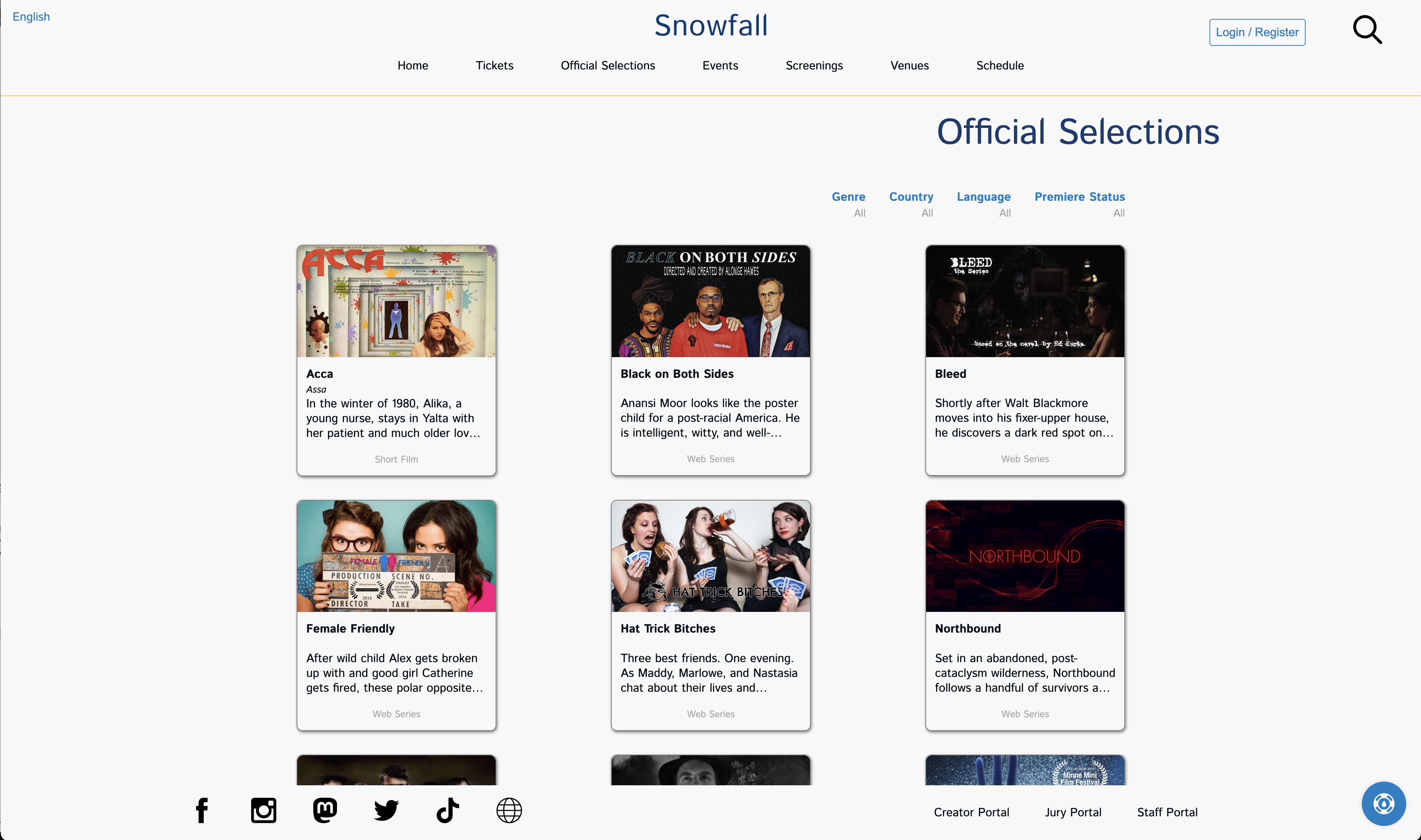
The Snowfall Official Selections Page
When you go to this page, it not only lists the selections, but also lets you filter the list. What filters are available depend on how you have configured the festival in the festival settings area of the Staff Portal. For example, this festival has enabled the "promote genres" and "promote languages" settings. That means users can filter by genre or language. In addition, if you have been with us through multiple editions of your festival, people can see an archive of old selections.
Filters that always show (if relevant): edition, premiere
Filters you configure: genre, perspective, theme, language, and country.
Each selection shows its poster, the title, and a synopsis. A user can click on the selection to get to the main page for that selection (aka the selection page).
Selection Page
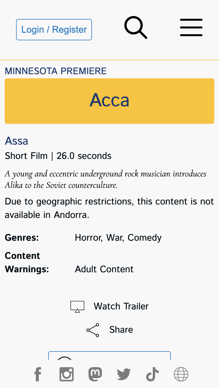
Each Official Selection receives its own "Selection Page". The selection page enables the visitor to see all the information we have collected on the selection and, if allowed, view the selection "on-demand".
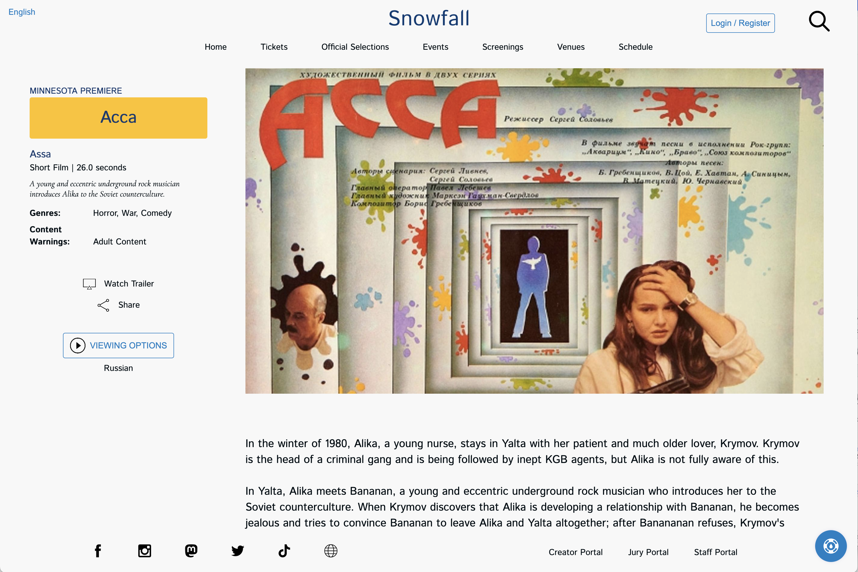
"Асса" as represented in the Snowfall theme
The example above highlights some of the aspects of how we handle selections in a language that differs from the user's configured language, with some elements shown in both the selection language and the user language.
The main area of the selection page contains project's poster with critical information about the selection, including how people can watch the selection. After the page loads, any trailer configured for the selection will automatically play (silently) over the selection poster while still allowing the user to interact with all content. They also have the ability to unmute the trailer and watch it.
NOTE: We recommend all filmmakers upload 1920x1080 trailers for the best look on this page.
Events Page
The events page lists all non-screening events. In other words, the events page will list both live streams as well as all in-person events EXCEPT in-person events with an event type of "Screening".
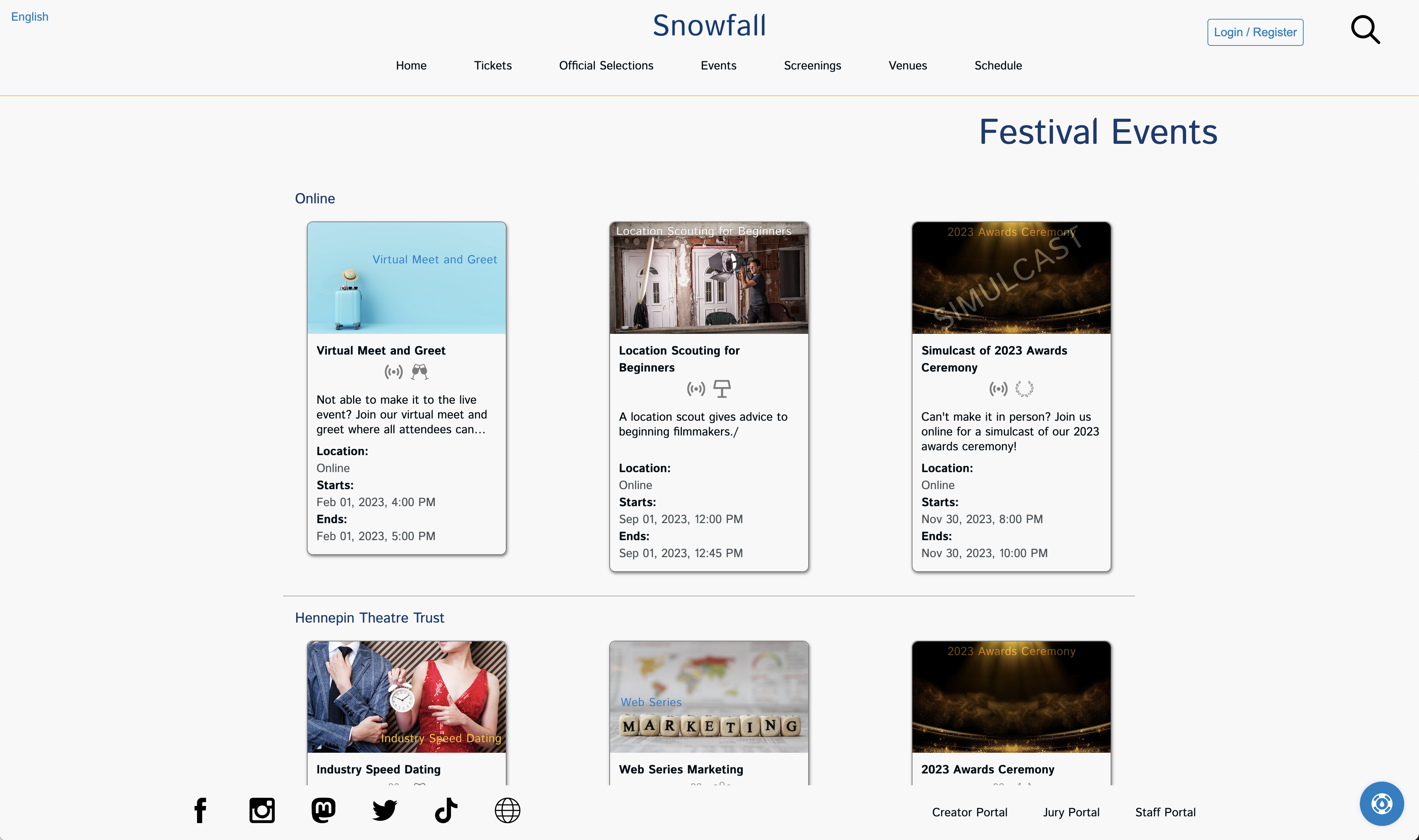
The Events page highlights your awards ceremony and the next event
The page breaks down events by venue, starting with any online events.
Event Page
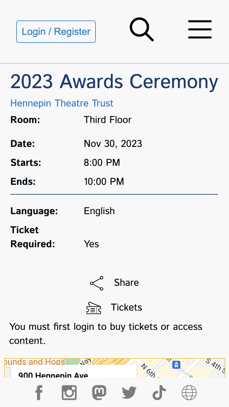
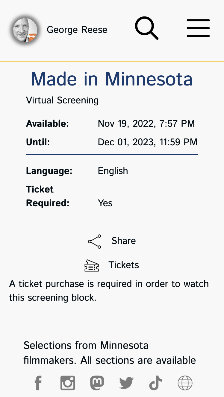
The event page is the official home for each event, including screening blocks and in-person screenings.
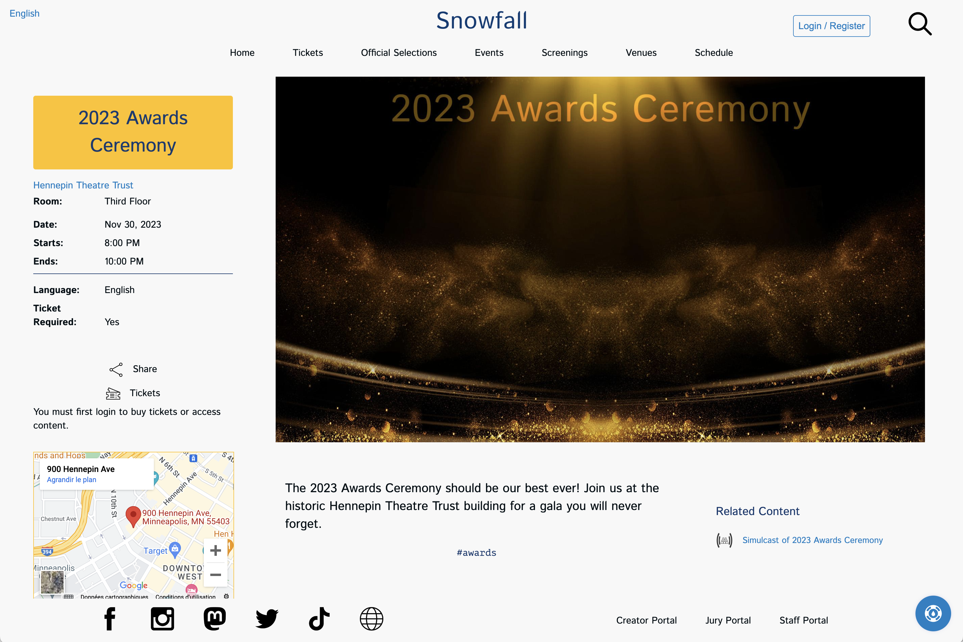 An example of the Snowfall event page for an awards ceremony
The event page contains all information you have provided about the event, including links to the venue, a map showing the location, and any related content like a live streamed simulcast. Visitors can purchase tickets to attend the event straight from this page. Because the user in the screen shot above has not logged in, there is a message that a login is required to purchase tickets.
Coming soon: venue weather
Live Streams
Live streams differ from what is shown above in that there is obviously no venue map and visitors are provided with a real time glance at how much time remains until they can join the live stream. Once the lobby for your live stream opens, a "Join Now" button appears on the page that allows them to join the live stream.
Screenings
Screenings show the full program of selections for the screening event. In-person screenings provide a venue map whereas online screening blocks do not.
Screenings Page
The screenings page lists all screenings associated with your festival. Both screening blocks and in-person events of type "Screening" are listed here.
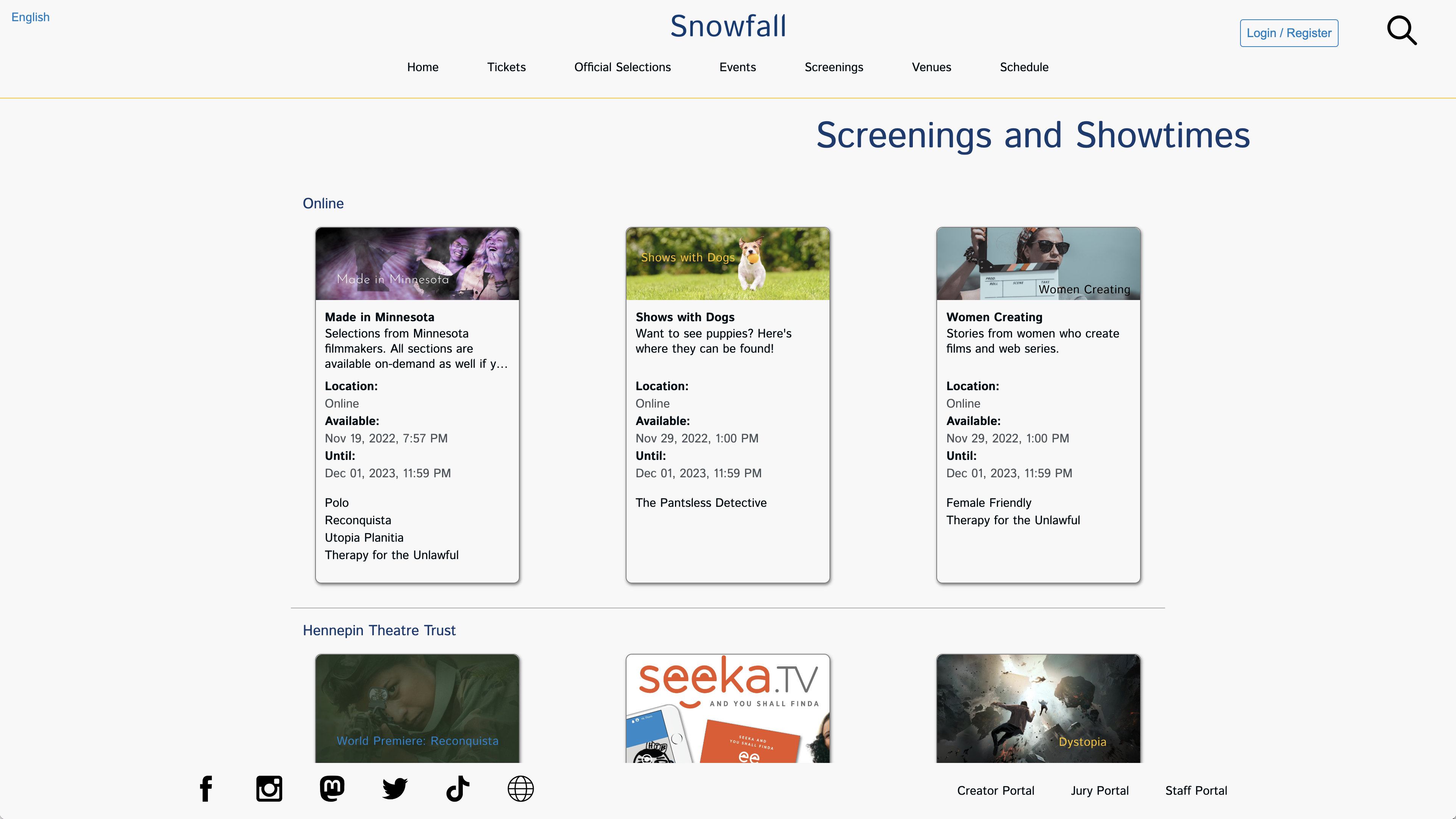
The Snowfall screenings shows screenings by venue
Starting with online screenings, screenings are grouped by their venue. A user can click on any screening to get full details on how to watch and what shows make up the screening.
Each screening on the page shows the full program and show times. Times for online screening blocks are in the visitor's time zone and times for in-person blocks are listed in the venue time zone.
Venues Page
The venues page provides a listing of all venues associated with the current edition of the festival. Simply adding a venue in the Staff Portal will not make it show up here. The venue must be associated with an event tied to the active edition of the festival.
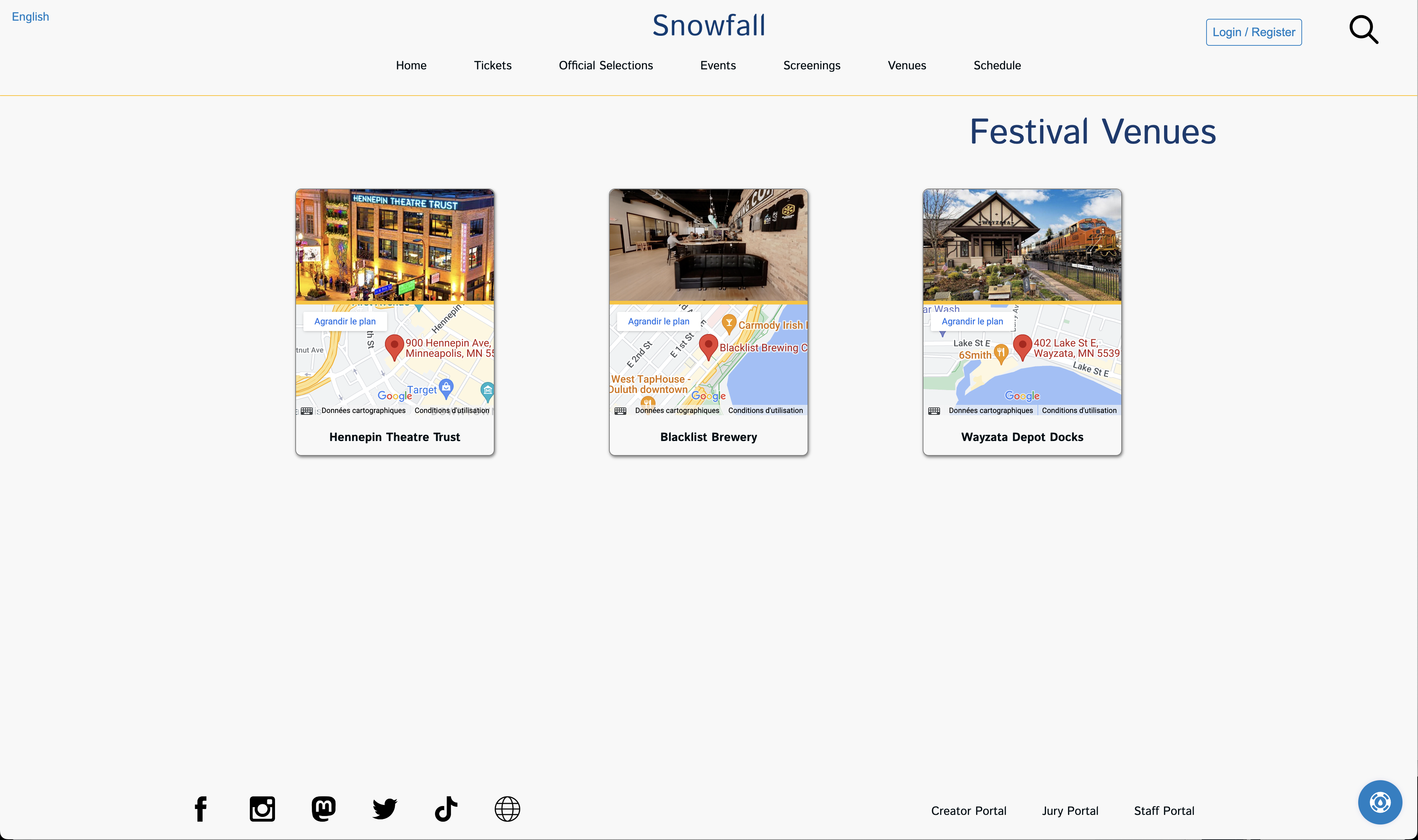
The Renaissance venues page gives quick access to venue information
Each venue appears with a link to Google Maps for the venue and the venue's venue page. If the venue has rooms associated with it, this page will list all of the rooms.
Venue Page
The venue page shows the details you have provided for each venue.
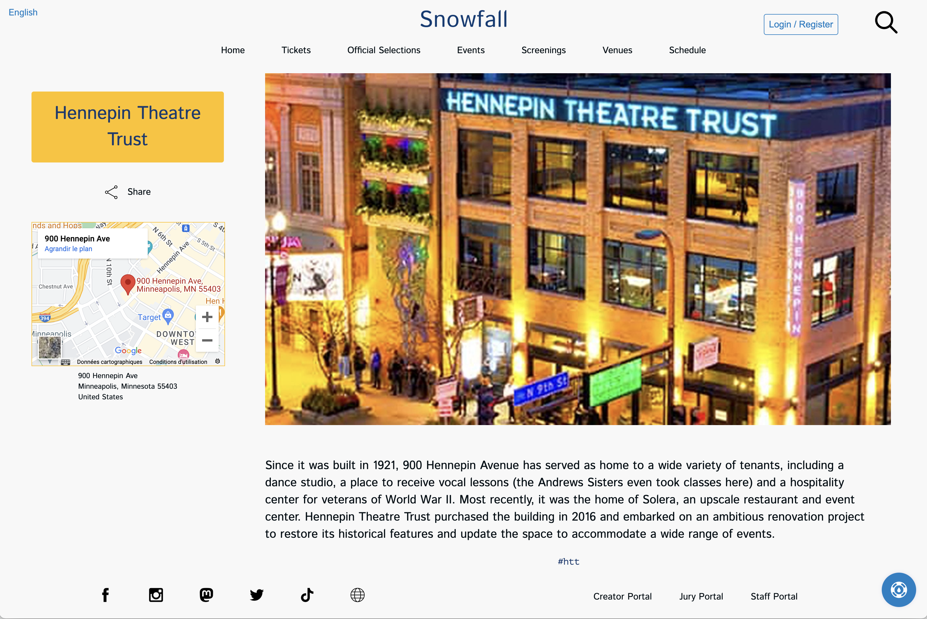
The venue pages feature your festival venues
Visitors get quick access to everything important about a venue, including a map and what events are taking place at the venue.
Merchandise Page
Currently, the merchandise page is an external page you host or from a third-party like Shopify. In the future, we intend to add built-in merchandising capabilities and this theme will support that functionality when added.
Full Schedule Page
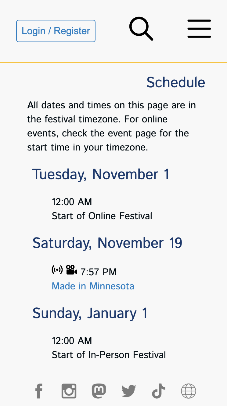
The schedule page enables visitors to get a look at the full festival schedule.
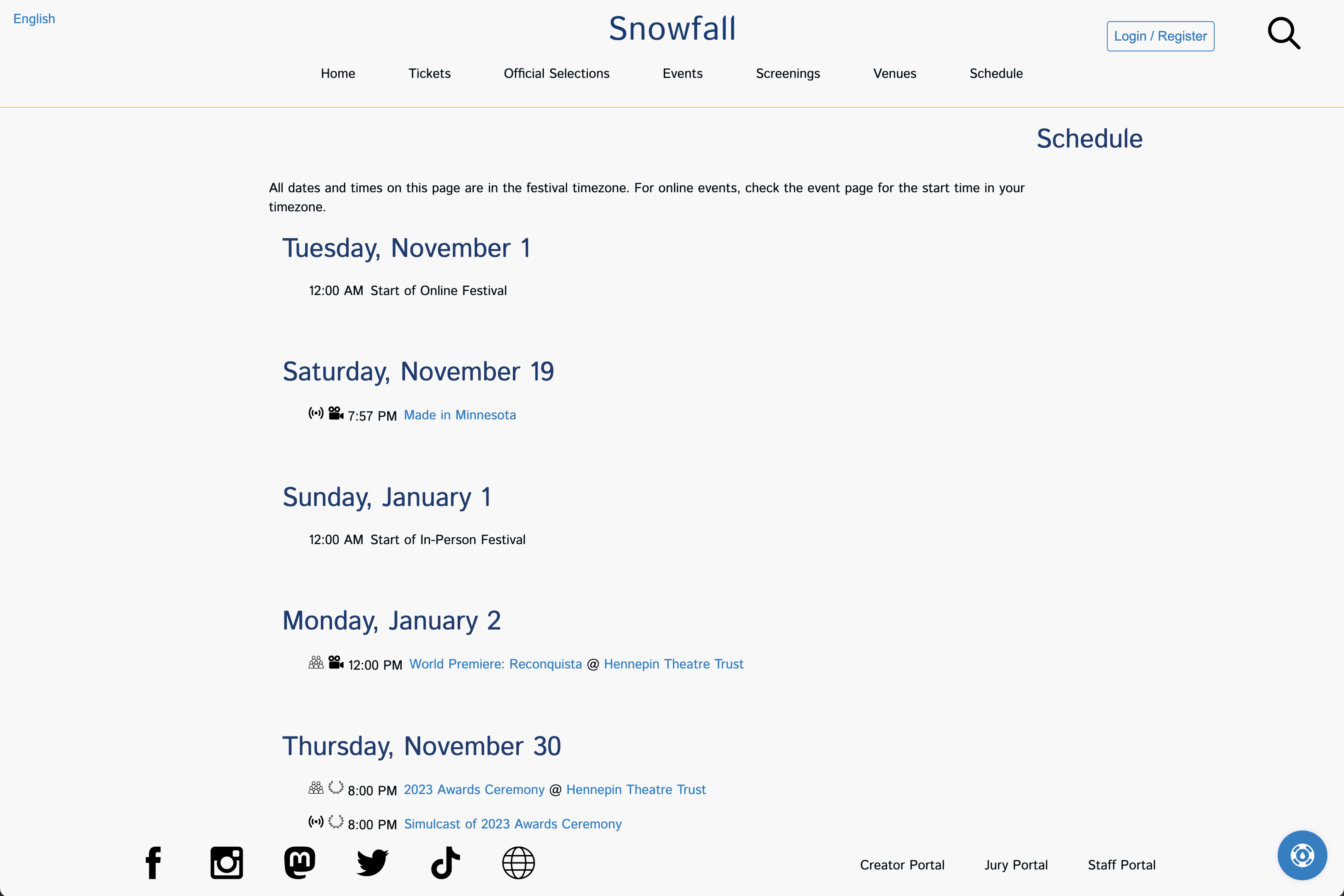
The schedule page shows each day of the festival with the events scheduled to start that day.
Each day of events from festival start until the end appears in order on this page (except for days that have no events). Each day shows every event for that day along to links to the event page and the venue page for that event. Icons show what kind of event it is and whether it is an in-person event or online event.
User Profile Page
The user profile page is where authenticated users manage their account with your festival.
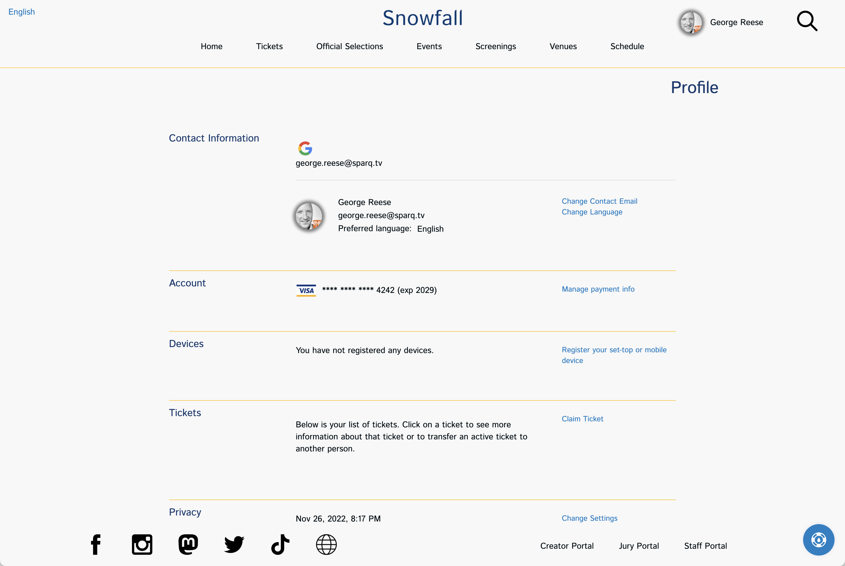
User's manage their personal information on the User Profile Page
This page enables a visitor to transfer tickets, change their contact information, manage payment methods, view device registrations, and control their privacy settings.
Watch List
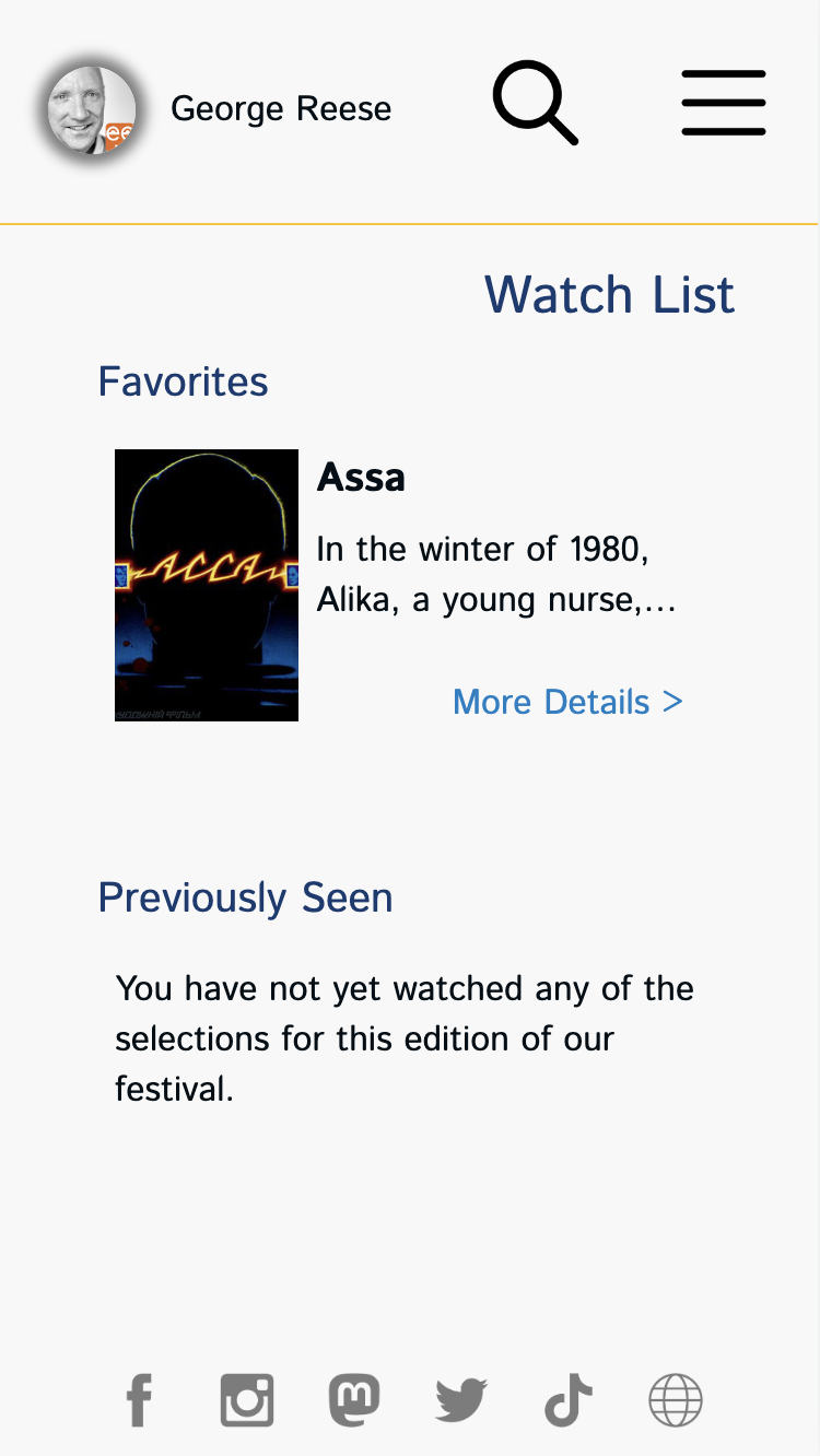
Visitors have the ability to "favorite" individual selections. In addition, we keep track of everything they have been watching. The watch list page provides them with access both to their favorite selections and everything they have been watching previously.
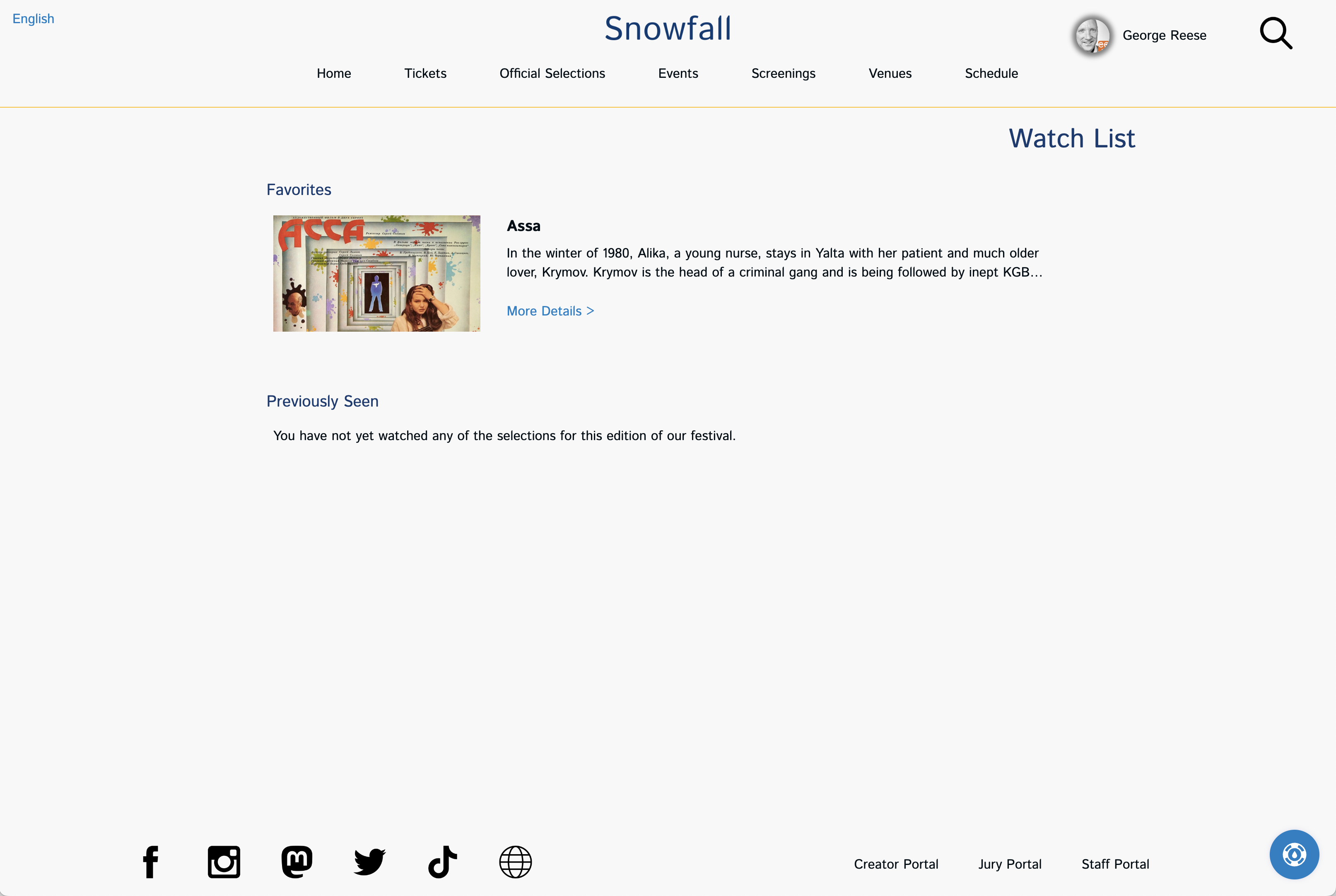
A Watch List page from the Renaissance site theme
Audience Choice Page
The audience choice page is where your audience goes to vote.
A sample audience choice voting page
The audience choice page is available only if you are using our judging module to perform audience choice voting. Though a full description of this functionality is outside the scope of this document, this page shows all of the available categories in which a viewer can vote on the left side along with all of the selections the visitor has seen (online or in-person) listed on the right side. The viewer can then drag selections from the right over to the category on the left. Viewers can alternatively click on the category and select from a list eligible selections.
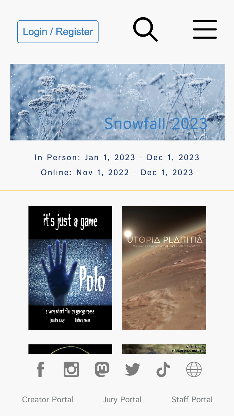
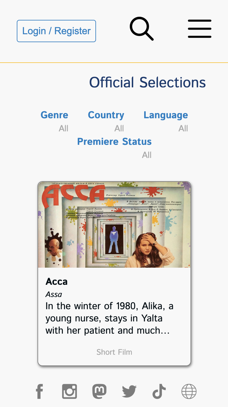
Mobile
 |
 |
 |
 |
 |
 |
 |
 |